
Description
SPECIFICATIONS
Additional product features: Waterproof
Battery Included: no
Brand Name: DROXUANK
Choice: yes
Compatible: Meta Quest 2,Oculus Quest 2
Compatible Brand: meta quest 2
Compatible Model: meta quest 2
High-concerned chemical: None
Model Number: Face Pad Cover
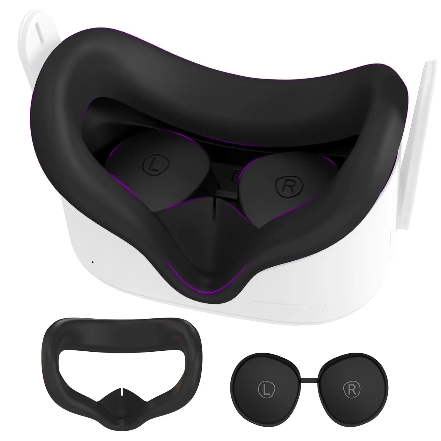
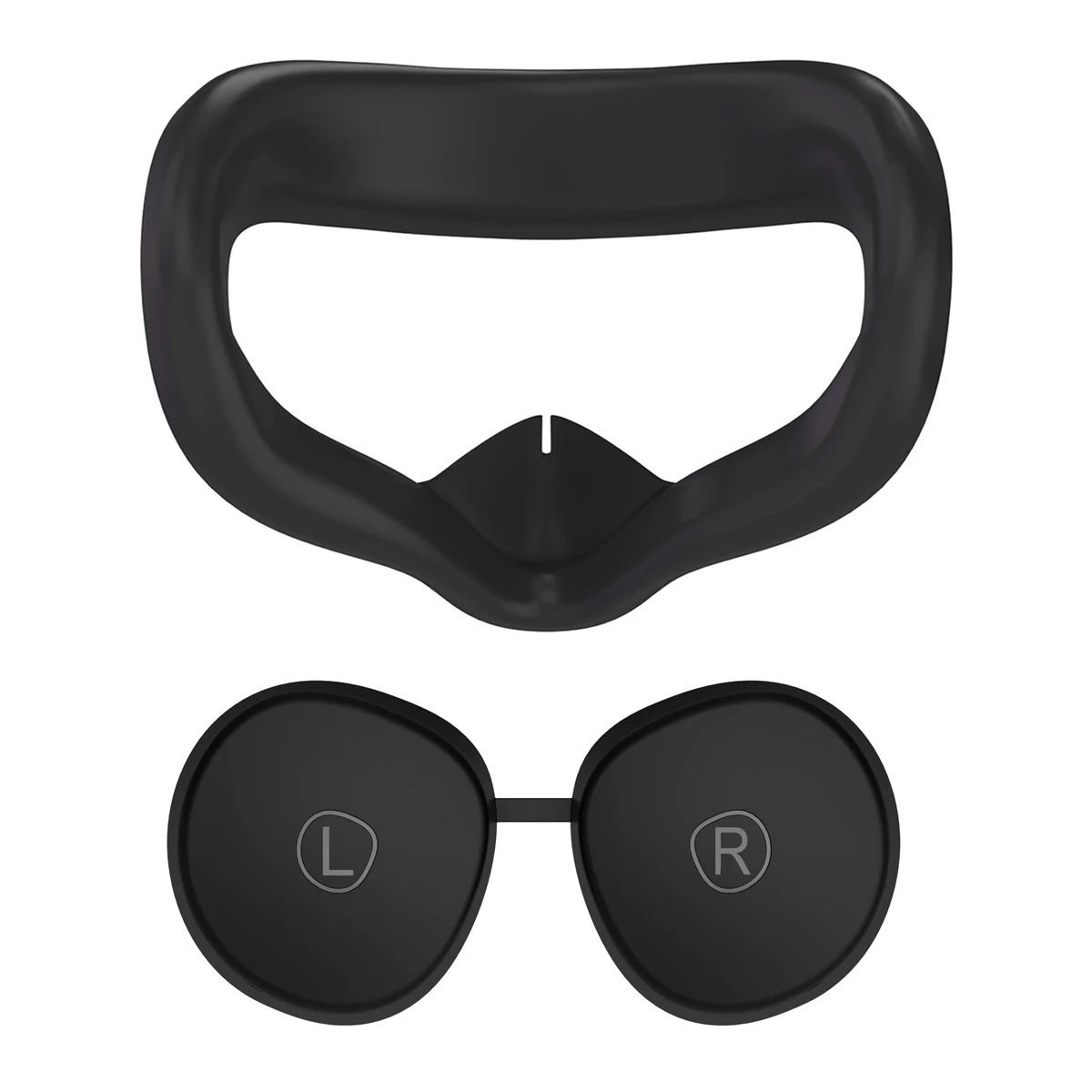
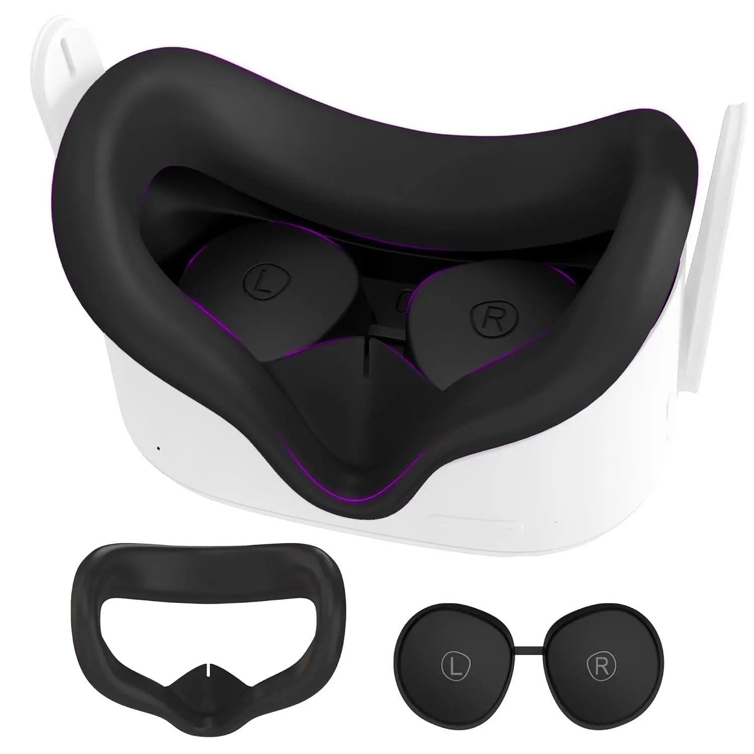
Notice: no VR,only Face Pad Cover and eye cover
Origin: Mainland China
Package: Yes
Product Dimensions: 9.8 x 0.6 x 7 inches
Support wireless connection: No
Type: Cables
Weight: 65g
semi_Choice: yes
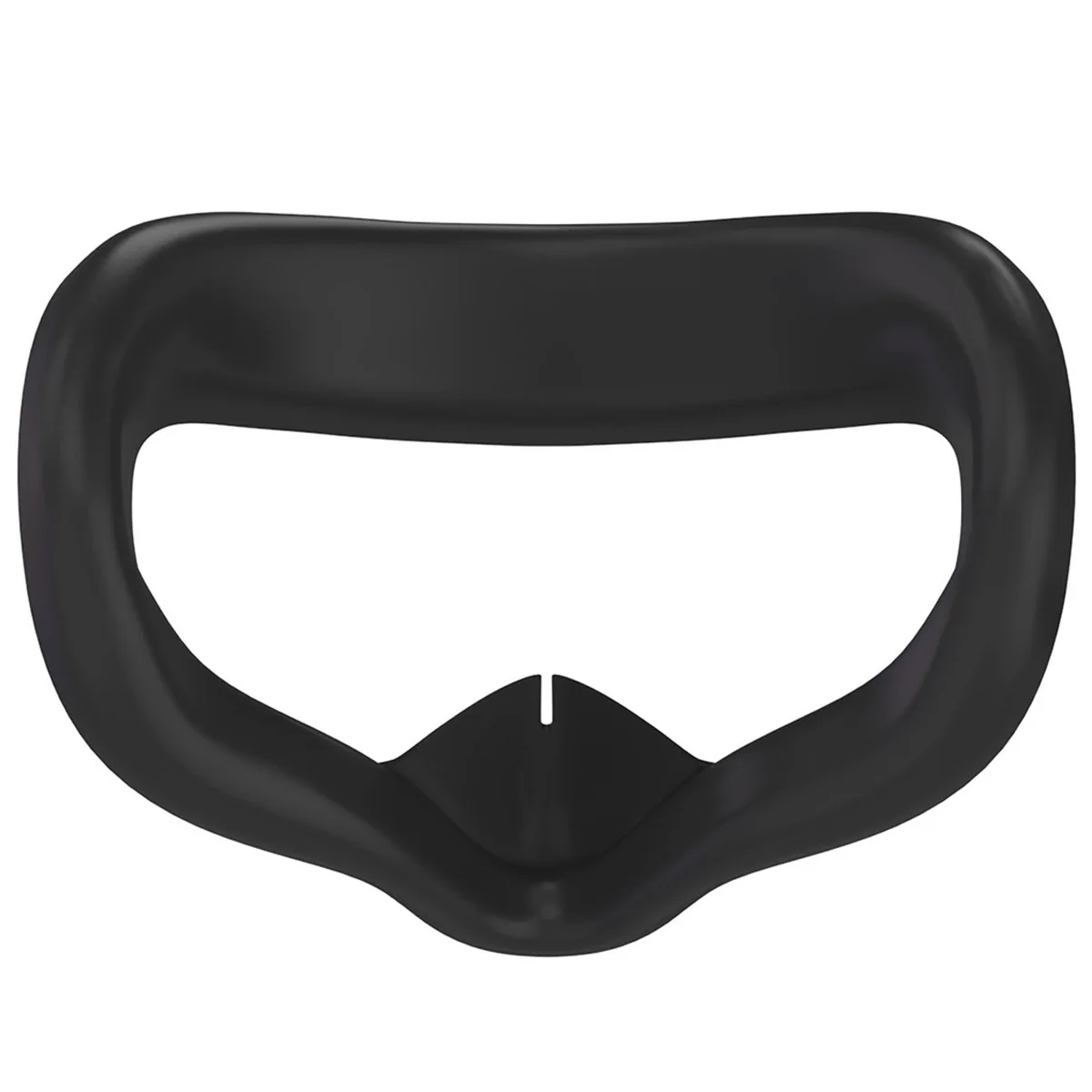
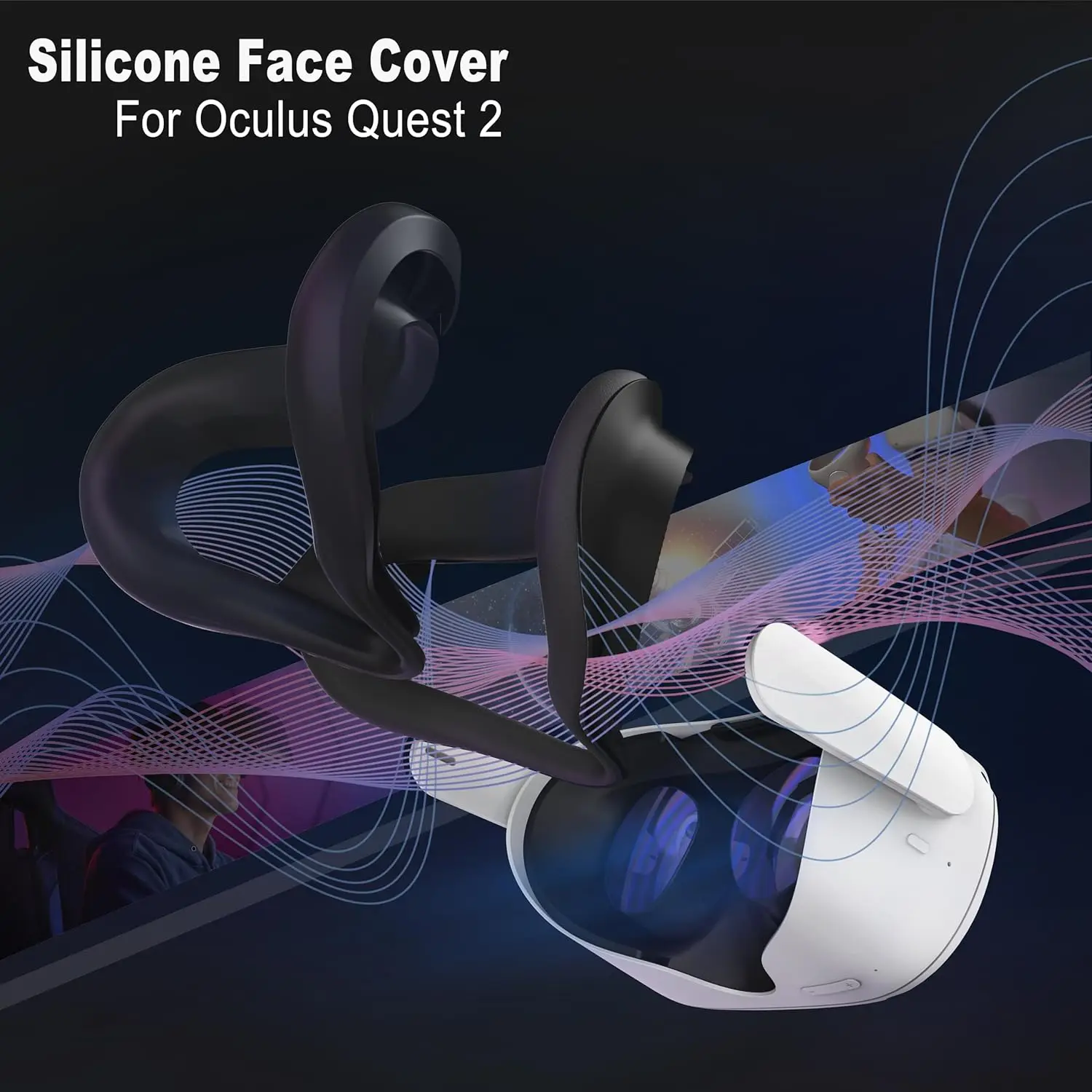
Face Pad Cover for Oculus Quest 2 with Lens Covers Protectors Washable VR Silicone Covers for Meta Quest 2 VR Accessories
Feature:
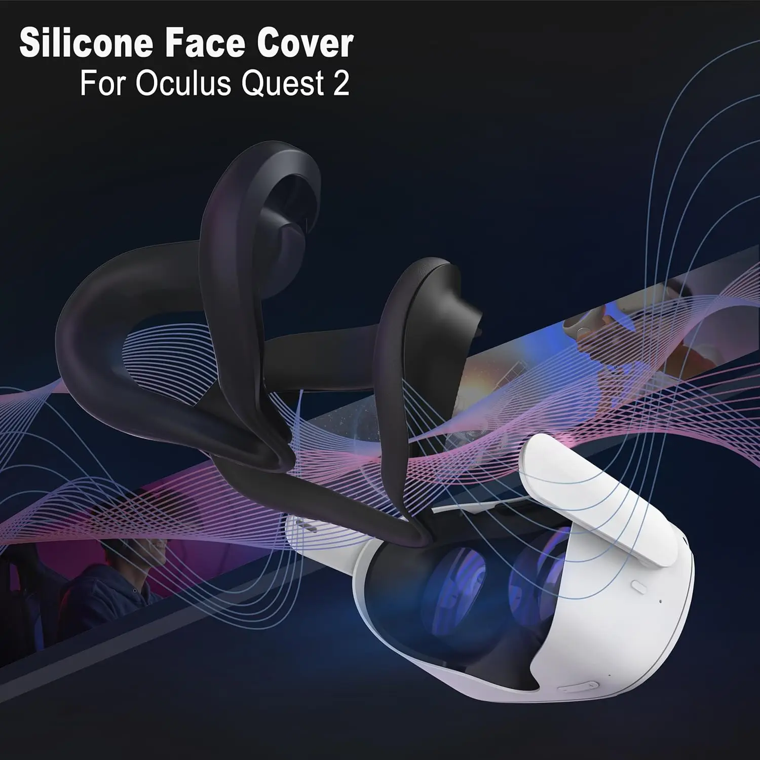
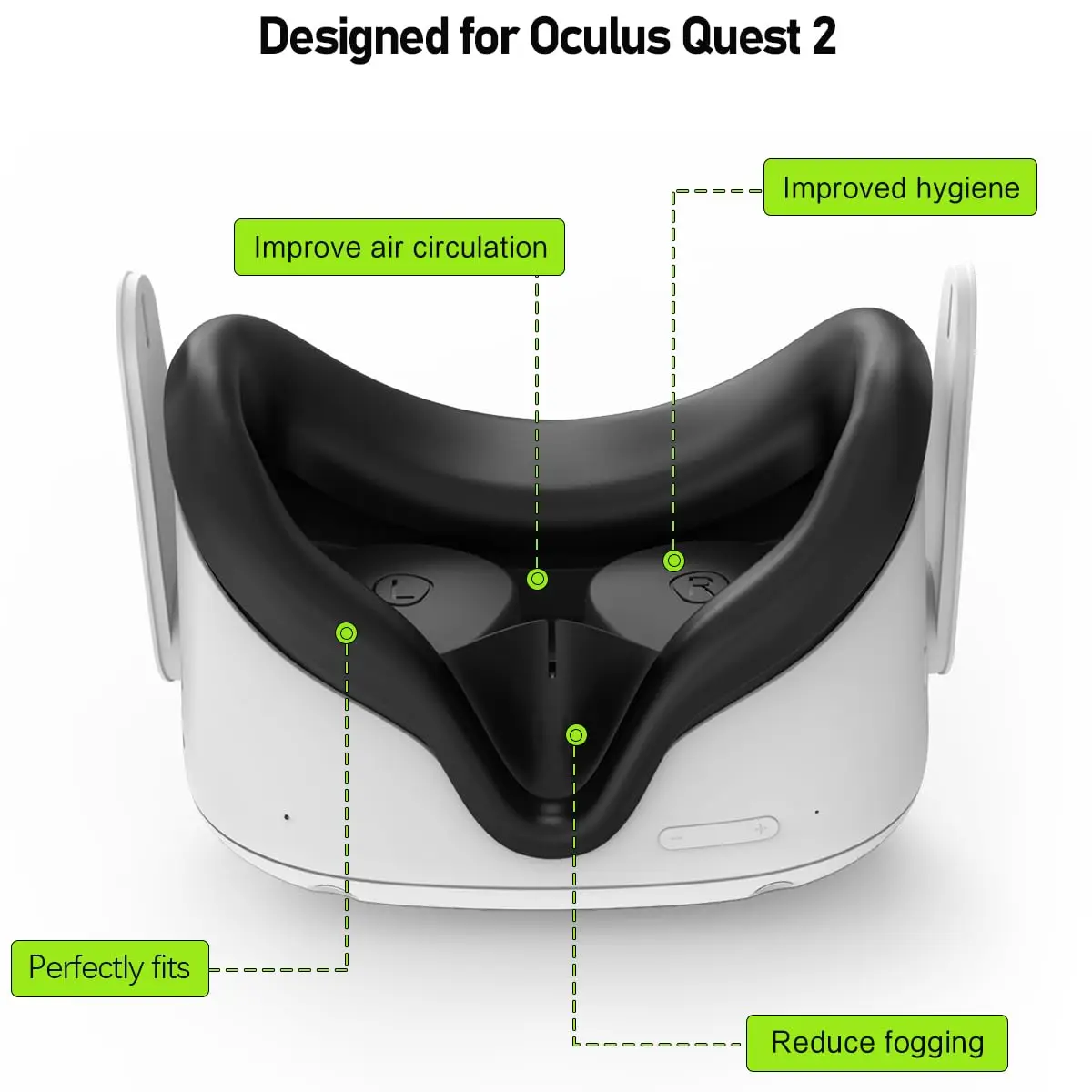
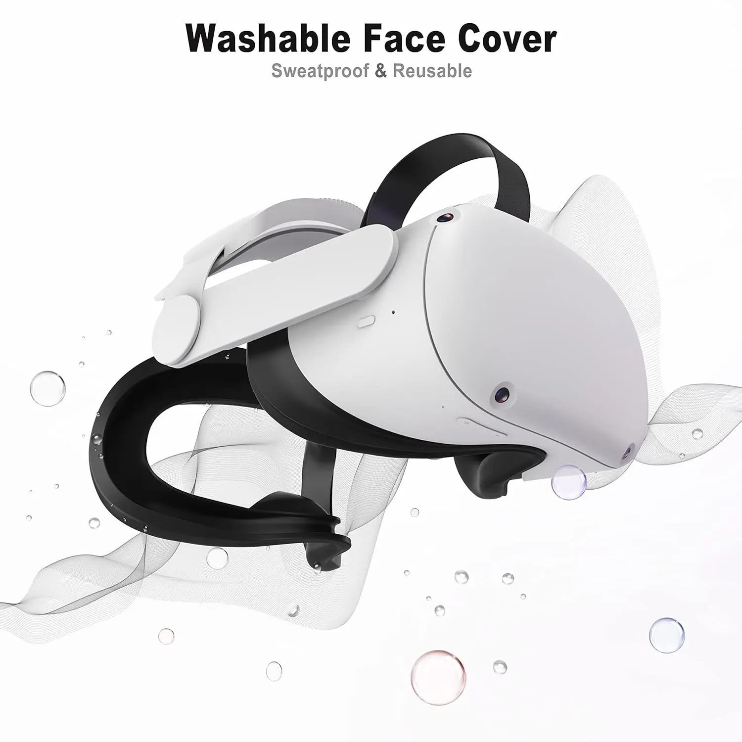
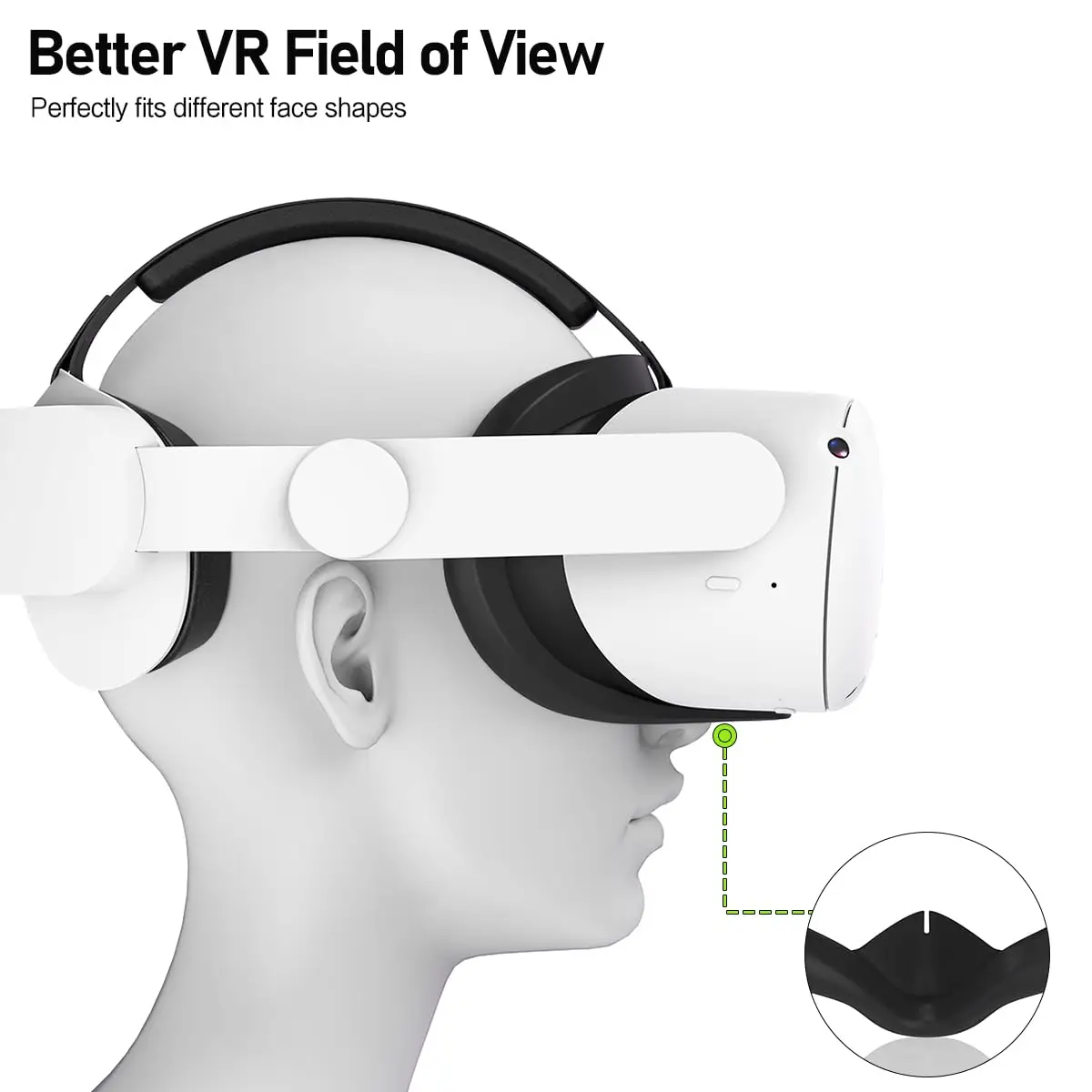
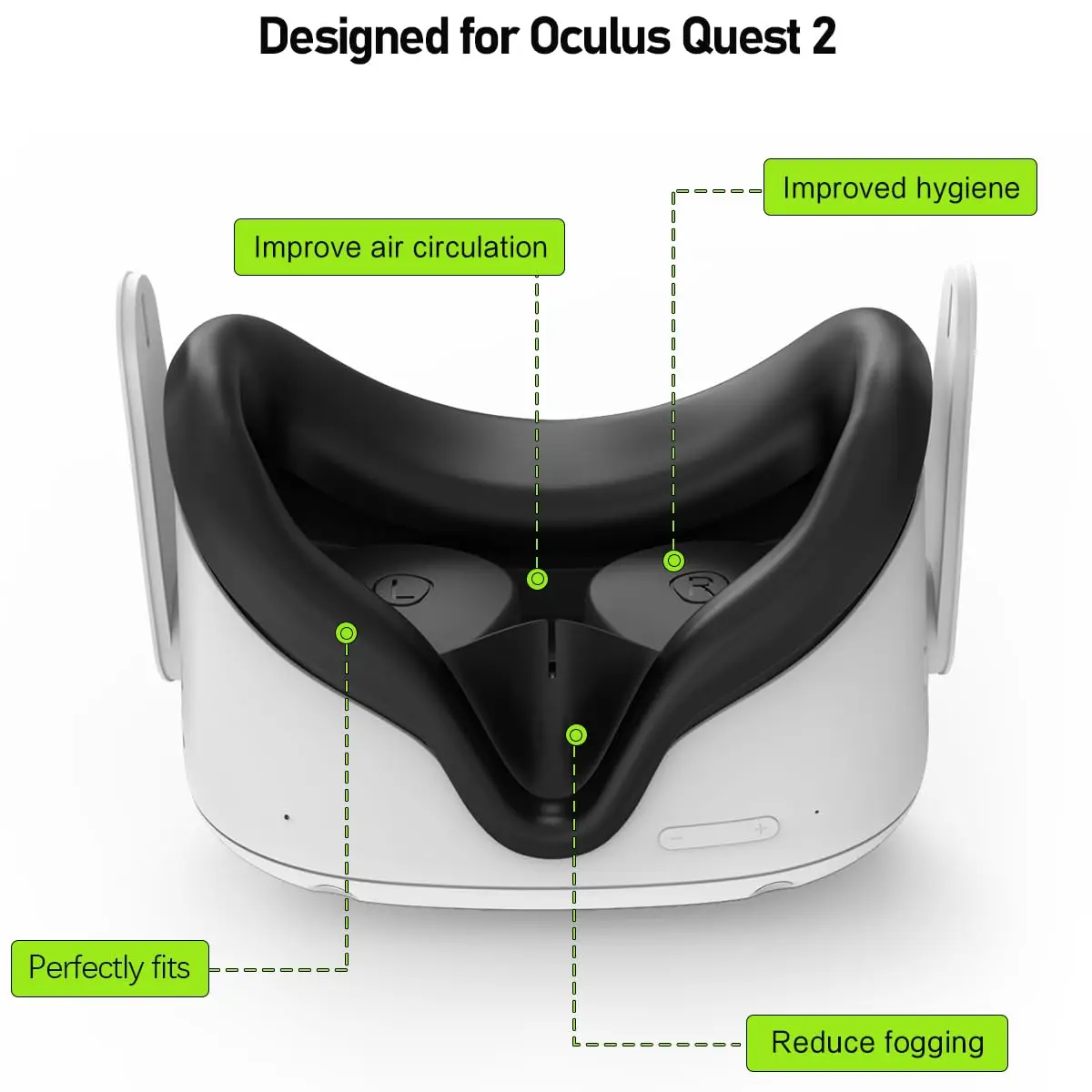
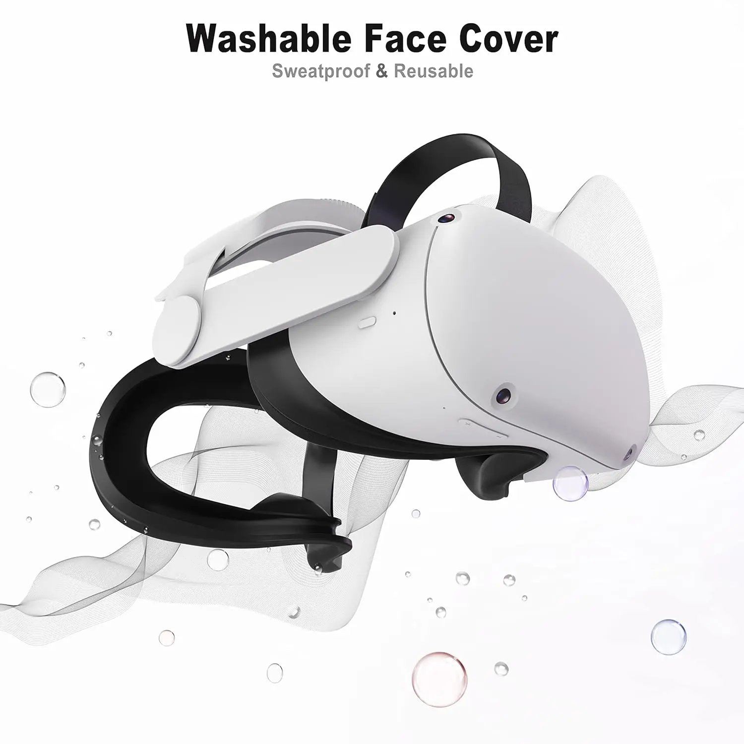
- Skin-Friendly VR Experience: Specifically crafted to address skin irritation concerns,this silicone VR cover is compatible with Oculus Quest 2. The high-quality silicone material ensures a soft,sweat-proof experience,preventing light leakage and enhancing your VR immersion without leaving unsightly sweat stains.
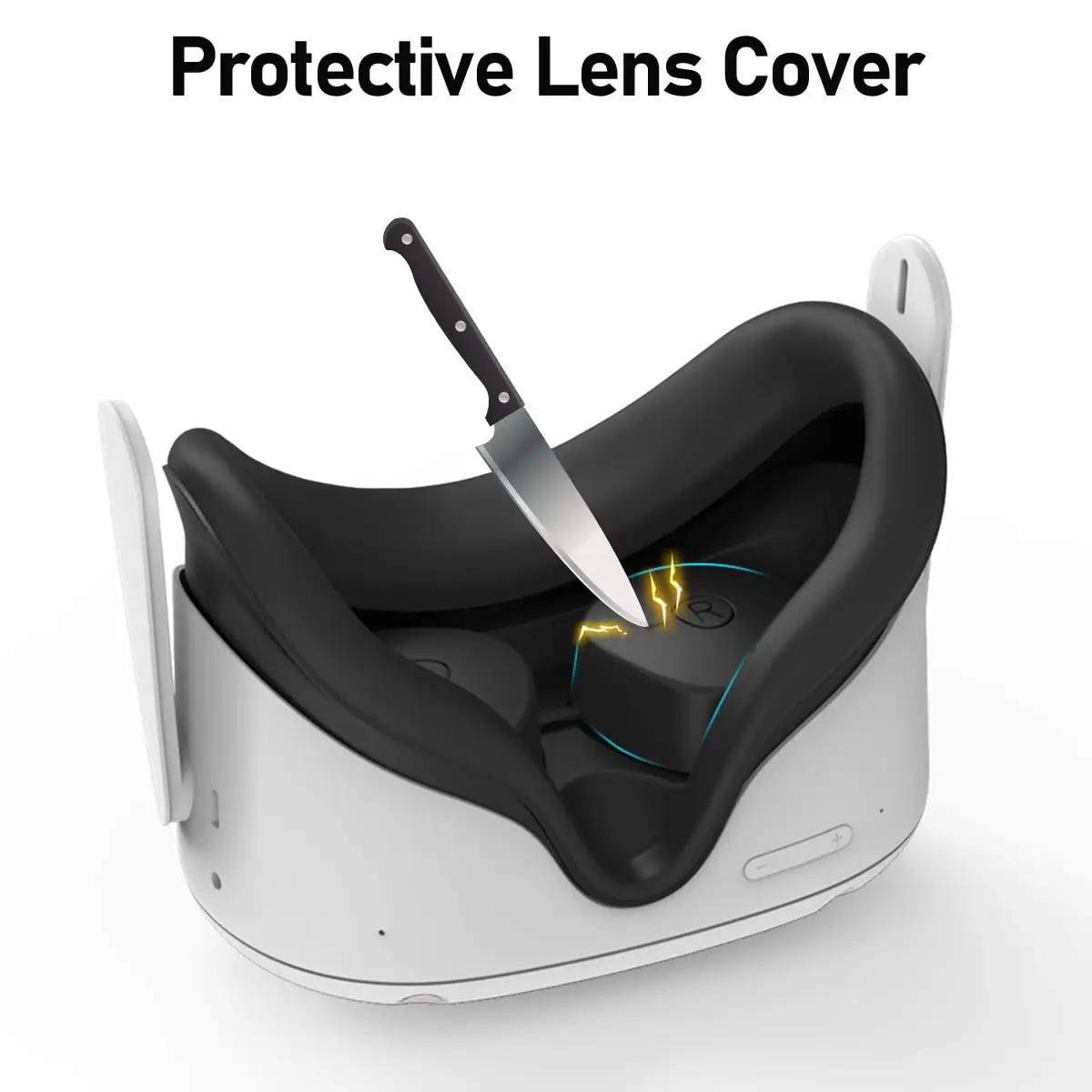
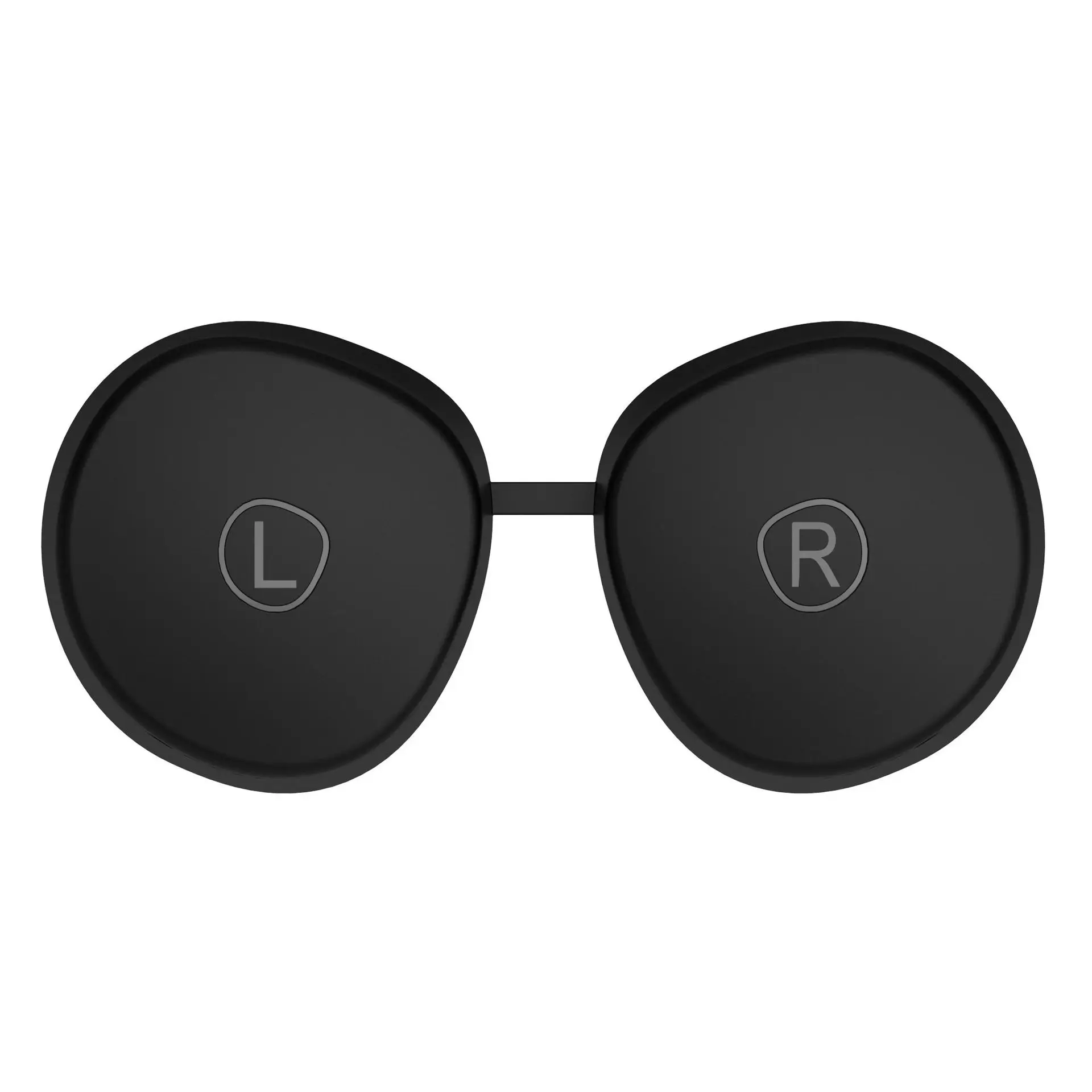
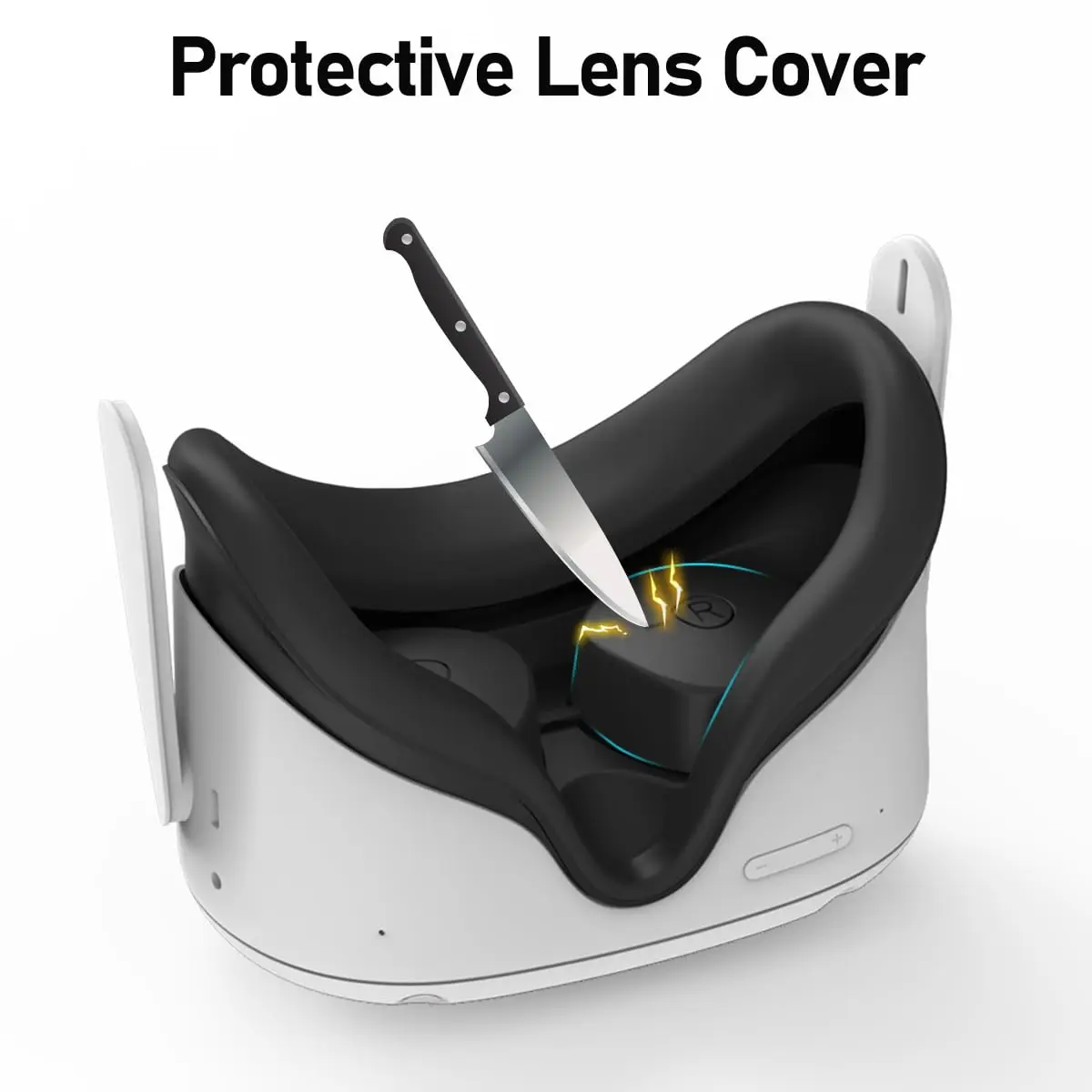
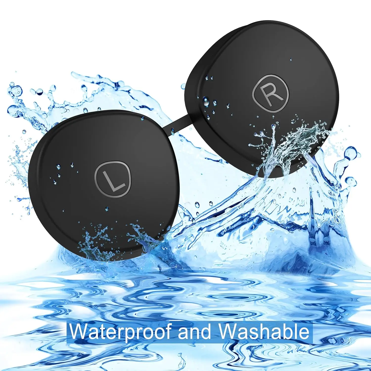
- Protective Lens Cover: Alongside the face pad,enjoy a simple yet efficient lens cover that safeguards your lenses from dust,scratches,and sun damage. Ensure your lenses remain in pristine condition,preserving the visual quality of your VR experience.
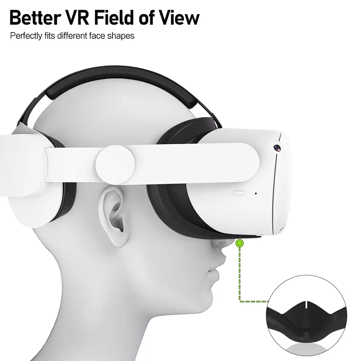
- Enhanced VR Immersion: Enjoy a snug and comfortable fit during long gaming sessions with the Quest 2 face pad. Its soft and plush material ensures a gentle touch against the skin,providing a significantly more comfortable gaming experience compared to the original foam cushion.
- Easy Installation and Cleaning: The silicone face cover is hassle-free to install and offers easy removal for cleaning,ensuring a sanitary experience,especially when shared among multiple users.
- Ideal Gift for VR Enthusiasts: With its durability,hygiene,and comfort-enhancing features,this VR cover stands as an ideal gift for family and friends who enjoy immersive VR experiences.
/*
* Used when device = desktop
* Configured in: configuration/brazil-config/global/brand-story.cfg
*/
/* Because the carousel is implemented as an ol list,
any lists in the card text will have a secondary list style (letters).
This will give an incorrect appearance to viewers,
so we set all lists to the primary list style (numbers). */
.aplus-brand-story-card ol li {
list-style: decimal;
}
/* Top level containers */
.aplus-module .apm-brand-story-hero {
-moz-box-sizing: border-box;
-webkit-box-sizing: border-box;
box-sizing: border-box;
width: 1464px;
height: 625px;
background-color: #fff;
}
.aplus-module .apm-brand-story-card {
-moz-box-sizing: border-box;
-webkit-box-sizing: border-box;
box-sizing: border-box;
width: 362px;
height: 453px;
background-color: #fff;
}
.apm-brand-story-hero,
.apm-brand-story-card {
-moz-box-sizing: border-box;
-webkit-box-sizing: border-box;
box-sizing: border-box;
position: relative;
width: 100%;
height: 100%;
float: none;
}
.aplus-module.brand-story-card-1-four-asin .apm-brand-story-card {
/* Only 12px to account for image cell border */
padding: 12px;
}
/* Full background image (Hero 1 & Card 2) */
.aplus-module .apm-brand-story-background-image {
-moz-box-sizing: border-box;
-webkit-box-sizing: border-box;
box-sizing: border-box;
overflow: hidden;
position: absolute;
width: 100%;
height: 100%;
}
/* Card 1 small images */
.aplus-module .apm-brand-story-image-row {
-moz-box-sizing: border-box;
-webkit-box-sizing: border-box;
box-sizing: border-box;
height: 185px;
padding: 0px;
margin: auto;
display: flex;
}
.aplus-module .apm-brand-story-image-row .apm-brand-story-image-cell {
/* Use content-box to ensure image size matches editor schema */
-moz-box-sizing: content-box;
-webkit-box-sizing: content-box;
box-sizing: content-box;
padding: 0px;
margin: 0px;
width: 166px;
border: 1px solid #fff;
}
.aplus-module .apm-brand-story-image-row .apm-brand-story-image-cell .apm-brand-story-image-link {
display: block;
width: 100%;
height: 100%;
}
.aplus-module .apm-brand-story-image-row .apm-brand-story-image-cell .apm-brand-story-image-link .apm-brand-story-image-img {
display: block;
width: 100%;
height: 100%;
object-fit: cover;
}
/* Card 3 logo image */
.aplus-module .apm-brand-story-logo-image {
-moz-box-sizing: content-box;
-webkit-box-sizing: content-box;
box-sizing: content-box;
height: 145px;
margin: 0px 4px;
padding: 20px;
padding-bottom: 0px;
}
/* Text overlays */
.aplus-module .apm-brand-story-text-bottom {
-moz-box-sizing: border-box;
-webkit-box-sizing: border-box;
box-sizing: border-box;
position: absolute;
bottom: 13px;
left: 13px;
}
.aplus-module .apm-brand-story-hero .apm-brand-story-text-bottom {
background-color: rgba(0,0,0,0.6);
color: #fff;
padding: 13px 65px 13px 13px; /* accounts for overlap of first card */
width: 437px;
}
.aplus-module.brand-story-card-2-media-asset .apm-brand-story-text-bottom {
background-color: rgba(255,255,255,0.6);
color: #000;
padding: 13px;
width: 336px;
}
.aplus-module.brand-story-card-1-four-asin .apm-brand-story-text {
margin-top: 8px;
}
.aplus-module.brand-story-card-1-four-asin .apm-brand-story-text.apm-brand-story-text-single {
margin-top: 20px;
}
.aplus-module.brand-story-card-1-four-asin .apm-brand-story-text h3 {
white-space: nowrap;
overflow: hidden;
text-overflow: ellipsis;
}
.aplus-module .apm-brand-story-slogan-text {
-moz-box-sizing: content-box;
-webkit-box-sizing: content-box;
box-sizing: content-box;
margin: 0px 4px;
padding: 20px;
}
.aplus-module .apm-brand-story-faq {
-moz-box-sizing: content-box;
-webkit-box-sizing: content-box;
box-sizing: content-box;
padding-top: 10px;
}
.aplus-module .apm-brand-story-faq-block {
margin: 0px 10px;
padding: 10px;
}.aplus-v2 .apm-brand-story-carousel-container {
position: relative;
}
.aplus-v2 .apm-brand-story-carousel-hero-container,
.aplus-v2 .apm-brand-story-carousel-hero-container > div {
position: absolute;
width: 100%;
}/*
Ensuring the carousel takes only the space it needs.
The sizes need to be set again on the absolutely positioned elements so they can take up space.
*/
.aplus-v2 .apm-brand-story-carousel-container,
.aplus-v2 .apm-brand-story-carousel-hero-container {
height: 625px;
width: 100%;
max-width: 1464px;
margin-left: auto;
margin-right: auto;
overflow: hidden;
}
/*
This centers the carousel vertically on top of the hero image container and after the logo area (125px).
Margin-top = (heroHeight – cardHeight – logoAreaHeight) / 2 + logoAreaHeight
*/
.aplus-v2 .apm-brand-story-carousel .a-carousel-row-inner{
margin-top: 149px;
}
/*
Cards need to have a width set,otherwise they default to 50px or so.
All cards must have the same width. The carousel will resize itself so all cards take the width of the largest card.
The left margin is for leaving a space between each card.
*/
.aplus-v2 .apm-brand-story-carousel .a-carousel-card {
width: 362px;
margin-left: 30px !important;
}
/* styling the navigation buttons so they are taller,flush with the sides,and have a clean white background */
.aplus-v2 .apm-brand-story-carousel .a-carousel-col.a-carousel-left,
.aplus-v2 .apm-brand-story-carousel .a-carousel-col.a-carousel-right {
padding: 0px;
}
.aplus-v2 .apm-brand-story-carousel .a-carousel-col.a-carousel-left .a-button-image,
.aplus-v2 .apm-brand-story-carousel .a-carousel-col.a-carousel-right .a-button-image {
border: none;
margin: 0px;
}
.aplus-v2 .apm-brand-story-carousel .a-carousel-col.a-carousel-left .a-button-image .a-button-inner,
.aplus-v2 .apm-brand-story-carousel .a-carousel-col.a-carousel-right .a-button-image .a-button-inner {
background: #fff;
padding: 20px 6px;
}
.aplus-v2 .apm-brand-story-carousel .a-carousel-col.a-carousel-left .a-button-image .a-button-inner {
border-radius: 0px 4px 4px 0px;
}
.aplus-v2 .apm-brand-story-carousel .a-carousel-col.a-carousel-right .a-button-image .a-button-inner {
border-radius: 4px 0px 0px 4px;
}
 (function(f) {var


Reviews
There are no reviews yet.